Blog Dynamic
Widgetkit
Widgets
Currently available widgets
Slideshow
Grid
Grid Stack
Switcher
Map
Accordion
Gallery
Grid Slider
Slider
Parallax
Slideset
How to use
Use a shortcode to display your widget anywhere on your website
Start in the editor
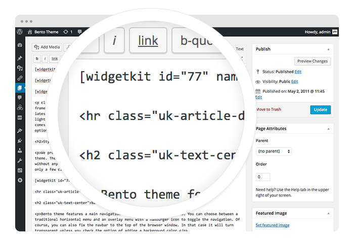
To get started, click on the Widgetkit button in your CMS edit view. You will be directed to an overview of already existing widgets, hit the New button. Now choose the widget you would like to render, for example Grid and the content type. Afterwards hit Create to proceed to the next step.
Explore the Interface
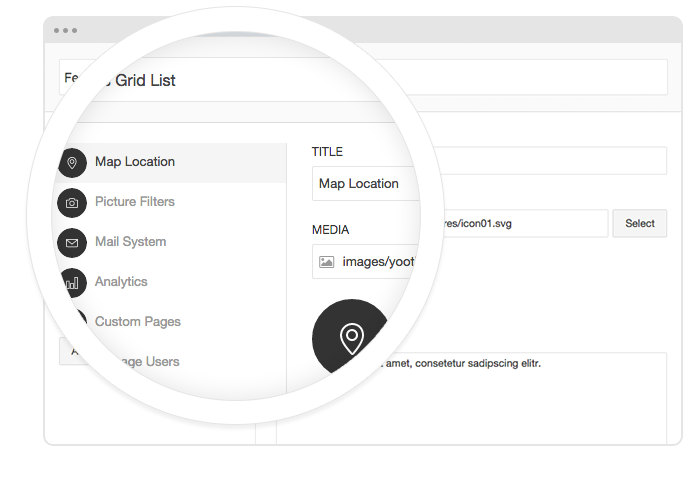
To create your content, you can add single content items by using Add Item. Alternatively you can use Add Media to select multiple items at once through the media library or manager of your CMS. Enter a name for your widget and go to the Settings tab to configure your widget, then hit Save.
Using the shortcodes
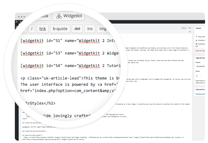
After saving, hit the Cancel button to get back to the widget overview. Click on your newly created widget and a shortcode containing the widget's ID and name will be inserted in the editor. To edit the widget, click inside the shortcode and hit the Widgetkit button again.
Features
All widgets make use of modern web technologies
- All widgets are fully responsive
- Use shortcodes to show widgets anywhere
- Clean and lightweight code
- User friendly interface
- Supports touch gestures for mobile devices
- Built with the UIkit framework
Features
Styles
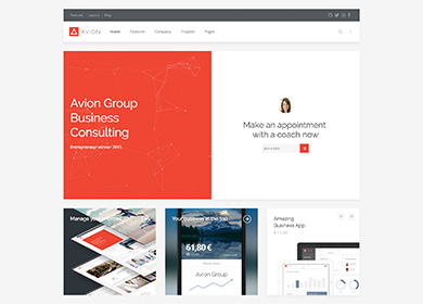
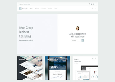
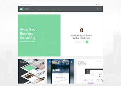
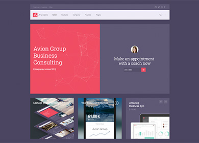
We provide lovingly crafted style variations to give you a glimpse of what is possible with this theme. The built-in theme customizer allows you to modify colors, fonts, sizes and much more without any CSS knowledge. Just choose your colors with the color picker and adjust the theme with only a few clicks. Click on one of the images to see the style.
Custom Classes
Avion includes a number of custom classes that extend the functionality of UIkit and Warp or help customize the styling of certain Widgetkit plugins. This table gives you an overview of the purpose of each of these classes.
| Class | Description |
|---|---|
.tm-slider-avion |
Add this class to the General section of a Slider Widget to place the navigation and content above the content. |
.tm-panel-box-alternative |
An additional panel box style, used in this theme's frontpage to adapt the bottom position for different styles. |
.tm-article-column |
Add this class to paragraphs, so they will be displayed in a two column layout. |
.tm-grid-divider |
Add this class to a grid or the General section of a Grid widget to apply vertical and horizontal dividers between grid items without adding a gutter. |
.tm-grid-list-line |
Create lists with horizontal dividers while splitting content and media into a grid, as seen in the third item of the tab widget on this theme's frontpage. |
.tm-list-line-icon |
Create a list with horizontal dividers and links inside the list items that are emphasized through a custom icon. |
.tm-nav-icon |
Add this class to a .tm-nav-side with links inside the list items that are emphasized through a custom icon. |
.tm-button-icon |
Add this class to a button to display a custom icon inside it instead of text. |
.tm-icon-xlarge |
Add this class to an icon to apply a font size of 58px. |
.tm-text-large |
Add this class to apply a font size of 16px (as opposed to 18px when using .uk-text-large. |
.tm-reset-panel-padding |
This class adds a negative margin to objects, reflecting the padding of a panel box. This can be handy, if you want content to cover the entire panel size. |
.tm-height-650 |
This class applies a height of 650px to block elements. |
