Features

This theme is built on the Warp framework, a well-engineered theme framework for WordPress and Joomla, and utilizes all of its latest features. The user interface is powered by UIkit, a lightweight and modular front-end framework, which provides the theme's styling. The theme also comes with a wide range of different layouts and widget variations.

Navbar layouts

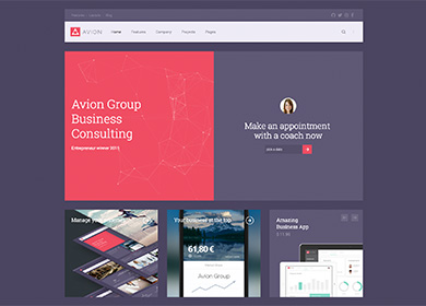
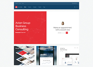
Avion theme features two different layouts for the main navigation that you can select in the Warp administration. One places the logo inside the navbar for a nice compact design, while the other one leaves the logo plenty of space by putting it above the navation. That way logo size will be no issue when working with this theme.

Navbar 01
Navbar 02

Custom Widgets

To enhance the features of Widgetkit 2, this theme includes a number of custom widget plugins. In addition to these widgets Avion also provides a custom Twitter widget as well as a .tm-slider-avion class to modify the styling of the Slider.

Gallery

Gallery

A special Gallery widget allows you to display an item’s title in an overlay and load the content and link on hover. Additionally you can use an elegant arrow icon instead of a button for the lightbox.
Slideset

Slideset

Avion theme comes with a beautiful Slideset widget with an eye catching scale effect on hover. The custom date field is great, if you want to use the widget display an event calender.
Tabs Switcher

Tabs Switcher

This custom Switcher lets you toggle through different content items with a tabbed navigation that will always extend to fill the entire panel height. Of course, it adapts beautifully to all screen sizes.

JavaScript

We've created some neat JavaScript effects for Avion theme that will give your website a modern style and feel and invite visitor to play around with it. Here's a little overview with examples.

<div data-particles='{"color":"auto", "opacity": 0.35}'> ... </div>

Particles

This trendy effect simulates randomly moving particles being connected by lines that follow your cursor, sort of like zodiac signs. You can set the particles to be black, white or to adapt automatically to the background color that they are placed upon.

Ripple

Based on Google’s Material Design, the we’ve added a ripple effect to certain UI elements, like buttons. It responds to the position that you click on, thus creating an interactiveness to all actions. There's no additional markup necessary.

Styles

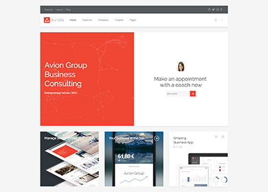
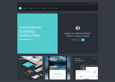
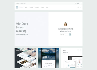
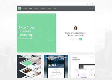
We provide lovingly crafted style variations to give you a glimpse of what is possible with this theme. The built-in theme customizer allows you to modify colors, fonts, sizes and much more without any CSS knowledge. Just choose your colors with the color picker and adjust the theme with only a few clicks. Click on one of the images to see the style.

Default
Turquoise
Light
Green
Lilac
Red

Custom Classes

Avion includes a number of custom classes that extend the functionality of UIkit and Warp or help customize the styling of certain Widgetkit plugins. This table gives you an overview of the purpose of each of these classes.

Class Description
.tm-slider-avion Add this class to the General section of a Slider Widget to place the navigation and content above the content.
.tm-panel-box-alternative An additional panel box style, used in this theme's frontpage to adapt the bottom position for different styles.
.tm-article-column Add this class to paragraphs, so they will be displayed in a two column layout.
.tm-grid-divider Add this class to a grid or the General section of a Grid widget to apply vertical and horizontal dividers between grid items without adding a gutter.
.tm-grid-list-line Create lists with horizontal dividers while splitting content and media into a grid, as seen in the third item of the tab widget on this theme's frontpage.
.tm-list-line-icon Create a list with horizontal dividers and links inside the list items that are emphasized through a custom icon.
.tm-nav-icon Add this class to a .tm-nav-side with links inside the list items that are emphasized through a custom icon.
.tm-button-icon Add this class to a button to display a custom icon inside it instead of text.
.tm-icon-xlarge Add this class to an icon to apply a font size of 58px.
.tm-text-large Add this class to apply a font size of 16px (as opposed to 18px when using .uk-text-large.
.tm-reset-panel-padding This class adds a negative margin to objects, reflecting the padding of a panel box. This can be handy, if you want content to cover the entire panel size.
.tm-height-650 This class applies a height of 650px to block elements.

Warp Framework

A fast and slick theme framework which is built on the latest web techniques like HTML5, CSS3 and PHP 5.3+

Visit Website

UIkit

A lightweight and modular front-end framework for developing fast and powerful web interfaces.

Visit Website

This theme is available for JoomlaJoomla and WordpressWordPress including the same features on each system.